In the world of design, there are few studios as innovative and boundary-pushing as SPIN Studio. With their unique blend of experimental typography and fine art sensibility, they have consistently defied conventional design trends and delivered exceptional branding solutions. One of their notable projects is the rebranding of Future Observatory, a design research organization that focuses on the green transition. In this article, we will explore the intricacies of SPIN’s brand identity for Future Observatory and delve into the studio’s creative process.
The Birth of Future Observatory
Future Observatory was launched in 2021 as a collaboration between the Design Museum and the Arts and Humanities Research Council. With a mission to explore how design can respond to the challenges of the climate crisis, Future Observatory aims to bring cutting-edge design research to broad audiences and shape the future of design. SPIN Studio was tasked with creating a brand identity that would capture the essence of this forward-thinking organization.
Imprinting a Distinctive Studio Style
SPIN Studio is known for its ability to infuse its unique style into its work while staying true to the client’s vision. With over thirty years of experience, the studio, led by Tony Brook and Patricia Finegan, has become synonymous with pushing the boundaries of typography and graphic design. Their work often reflects a raw and textured finish, reminiscent of the iconoclastic design of the 90s. This distinctive style is evident in their branding for Future Observatory, where they grapple with the tensions between experimental typography and mainstream branding.
The Evolution of the Brand Identity
When SPIN Studio took on the rebranding of Future Observatory, they built upon the foundation of the organization’s previous brand identity. The original scheme was minimalistic, reflecting time and budget constraints. However, the new brand identity represents a fuller development of the initial idea, nurturing it to full efflorescence. SPIN’s approach was to refine and reimagine the existing logo, combining it with a bespoke typeface and a revamped symbol.
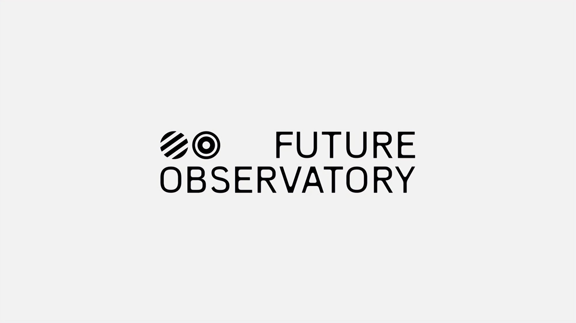
The logo, a representation of two eyes looking towards the past and the future, encapsulates the essence of Future Observatory. SPIN creatively reimagined the logo with an understatedly weird typeface, giving it a touch of eccentricity. The symbol of two circles, varying in design depending on the application, adds further depth to the visual identity.
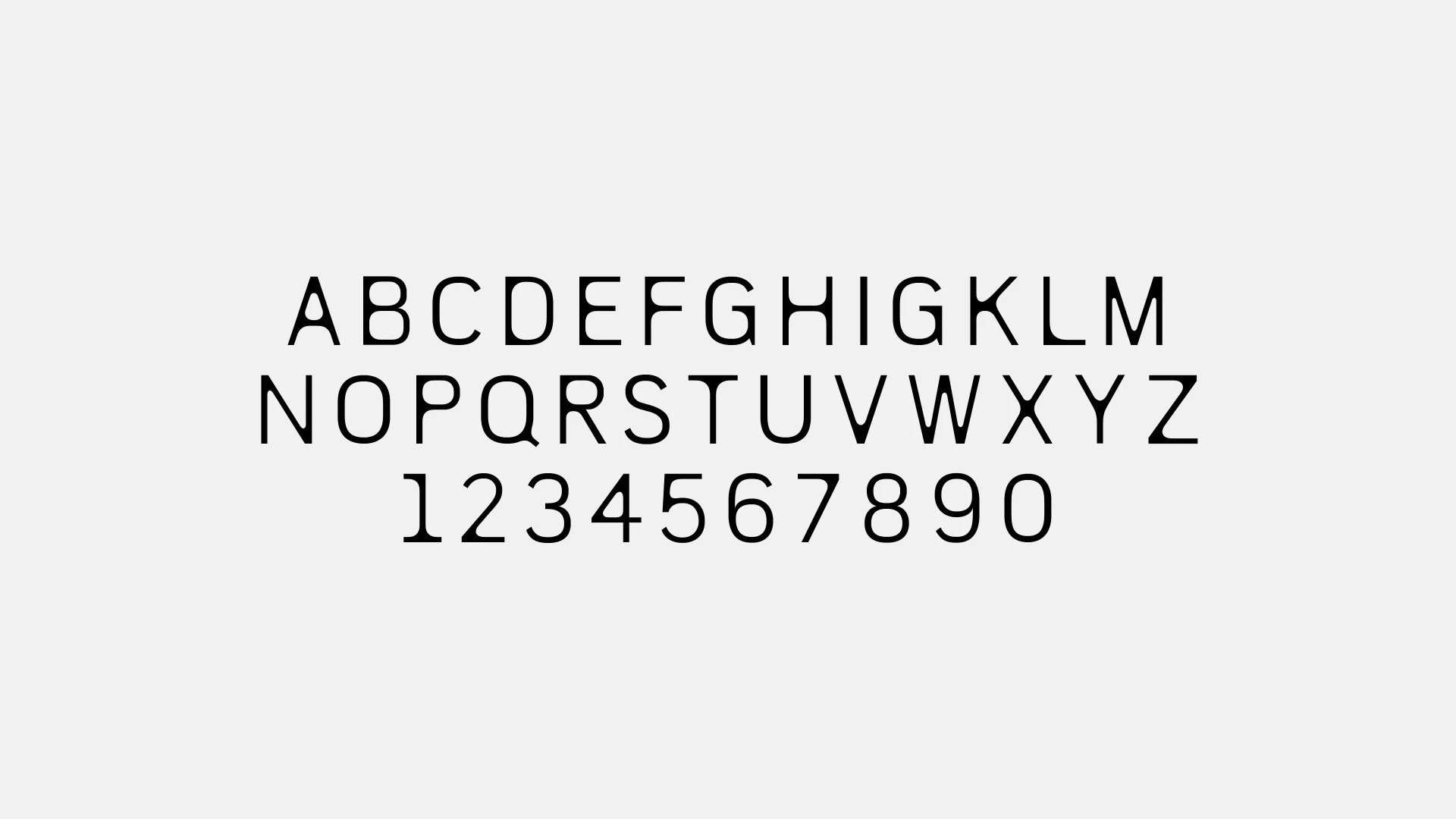
The Organic Typeface
The bespoke typeface designed by SPIN for Future Observatory is conceptually impressive and executed with elegant restraint. Inspired by natural growth patterns, the typeface features rounded connections between stems and crossbars, evoking a sense of organic sinew grafted to a sharp-edged robotic skeleton. While the intended sense of natural growth might not be palpable in the finished product, the typeface brings a futuristic and alien aesthetic to the brand. It successfully captures the mix of organic and digital aesthetics that define Future Observatory’s vision for the future of design.
Typography and its Challenges
In their case study, SPIN presents three versions of the logo, including two stacked variations. While the purpose of these variations is not explicitly stated, they seem to offer flexibility in placement. However, the logo predominantly appears centered in layouts or with the wordmark and symbol separated. This lack of clarity in logo variants reflects a broader need for more rigorous application guidelines and visual hierarchy. The website, in particular, sometimes feels crowded and would benefit from tighter regulations.
The logotype is expanded into a display typeface called FO Display, used for titles and headings across various applications. While FO Display has two weights, regular and slightly bolder, there is an additional variant with more deeply rounded internal corners, as seen when hovering over the font on the website. This typographic hover effect brings a sense of organic movement and should be given a clearer, intentional role in the brand. The contrast between FO Display and the secondary fonts, Executive and Media77, could be enhanced to create a more harmonious typographic scheme.
Nostalgic Nods and Brand Disruption
The use of Executive and Media77, the secondary fonts in the brand identity, injects a touch of nostalgia into the design. Executive, inspired by the lettering of Hammond typewriters, adds a mid-century analogue technology vibe. Media77, a 70s-inspired serif font, disrupts the typographic scheme and brings warmth to the brand. However, the integration of Media77 could be more thorough and visible, as it currently remains buried within article pages and is not highlighted in SPIN’s case study. Giving Media77 a more prominent role would elevate the overall typographic scheme.
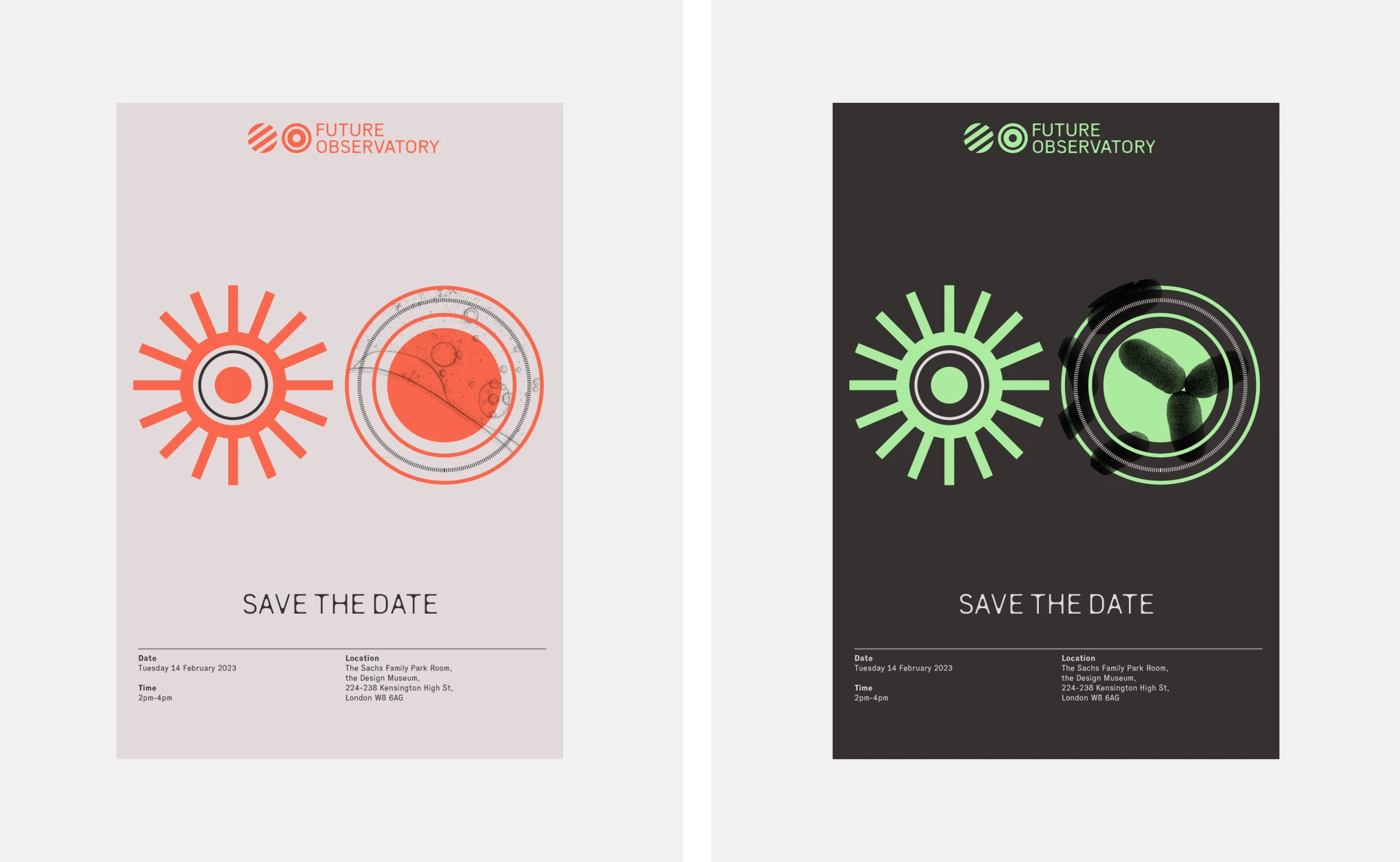
A Clever Graphic Language
In addition to the logo and typography, SPIN Studio developed a clever graphic language for Future Observatory. The language revolves around concentric circular symbols, evoking film reels, tape spools, and other mid-century analogue technology. This retro-futurist aesthetic, when animated and layered over video footage, creates distinctively branded video content. The animations simulate dilating pupils or refocusing optical lenses, adding a dynamic element to the brand identity.
A Restrained Color Palette
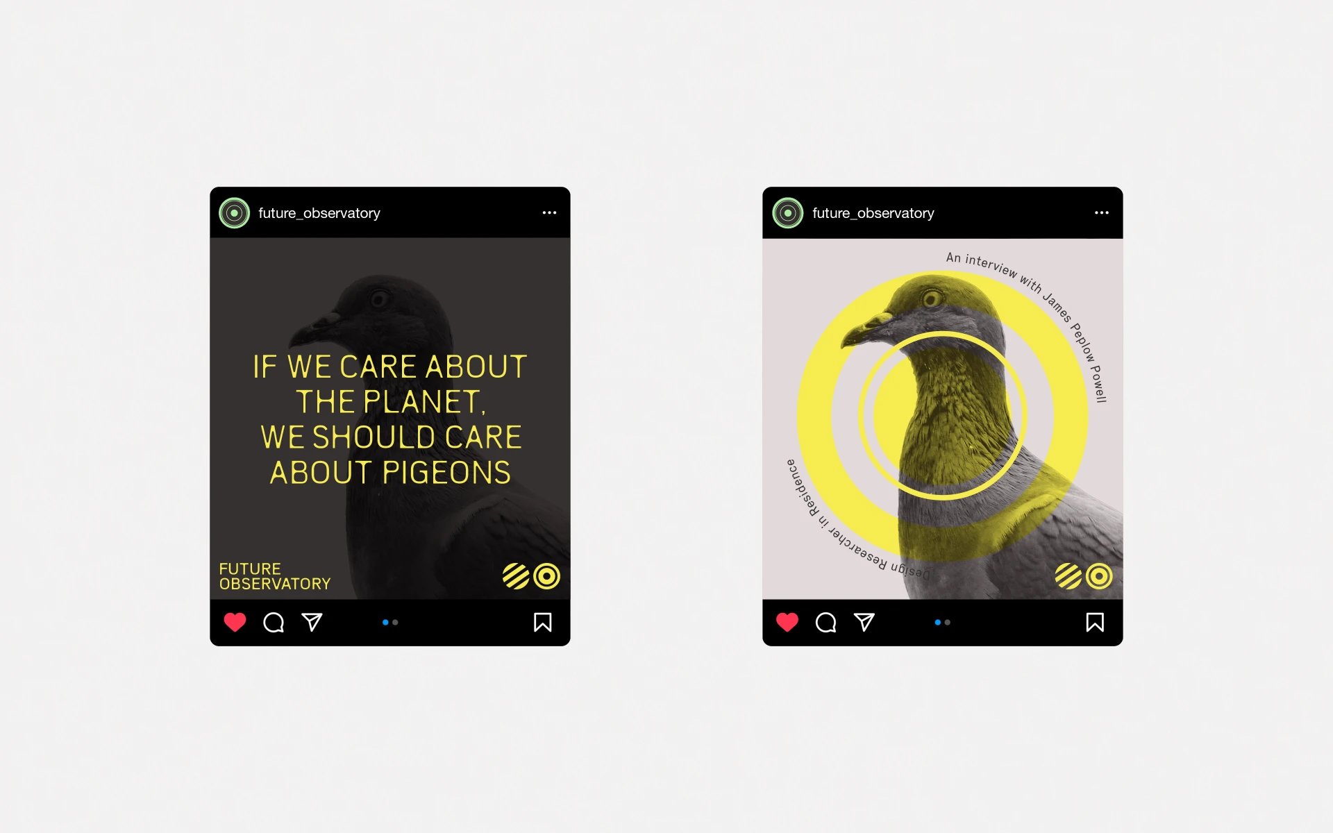
To complement the brand identity, SPIN Studio crafted a restrained color palette. Faded and acid toned accents harmonize with warm, pinkish grey shades, creating a retro-technological feel without appearing cold. The palette exudes a Brutalist aesthetic, reminiscent of the Barbican’s softened forms and lush vegetation. SPIN’s design philosophy, referencing a 1960s utopian vision of nature, technology, and humanity, resonates with the brand’s mission to address the challenges of the future.
A Dark and Ambivalent Vision
Future Observatory’s mission to assess how design can impact the future in a meaningful way requires confronting daunting problems and paradigms. SPIN Studio’s brand identity rejects techno-utopianism, embracing a darker and more ambivalent perspective. The overall design evokes associations with Dr. Strangelove and shadowy Cold War research projects, reflecting the studio’s intention to create a brand that is concrete and focused on design’s role in our interaction with nature.
Shaping the Future of Design
With their distinctive approach to branding, SPIN Studio has successfully captured the essence of Future Observatory. Through their innovative typography, organic typeface, and clever graphic language, they have transformed the brand identity into a visual representation of cutting-edge design research. By embracing both the past and the future, SPIN Studio has created a brand that challenges conventional design trends and paves the way for a new era of design innovation.
As Future Observatory continues its mission to shape the future of design, SPIN Studio’s brand identity will serve as a powerful tool in communicating its vision to broad audiences. The collaboration between the Design Museum, the Arts and Humanities Research Council, and SPIN Studio showcases the importance of design in addressing the challenges of the climate crisis. Through their revolutionary approach to design research, Future Observatory is poised to make a lasting impact on the future of design.