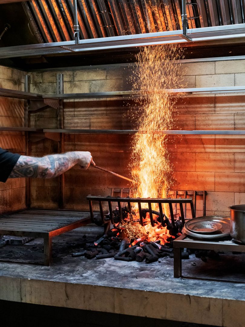
When it comes to branding, we often hear about the high-profile projects undertaken by big-name studios. However, there is something special about the branding journey of smaller entities by smaller studios. It offers a sense of light-footedness, delight, and wonderment that is often conveyed through the case studies. One such project that stands out is the branding of Argentinian restaurant Sucre London by London-based studio DutchScot.
Discovering Sucre: A Serendipitous Encounter
DutchScot’s journey with Sucre began a few years ago when they were recommended by a copywriter they shared a space with. The project was put on hold due to unforeseen circumstances, but for DutchScot, it became one of those projects that seemed to last forever. Finally, they were able to embark on the branding journey for Sucre, a well-respected staple of the Buenos Aires dining scene.
Nodding to Sucre’s Origins: A Subtle Connection
The first branch of Sucre was opened in Buenos Aires in 2001 by chef Fernando Trocca. The London counterpart had to subtly nod to the restaurant’s origins on a street called Mariscal Antonio Jose de Sucre, from which it takes its name. DutchScot took inspiration from the immigrant background and influences of Trocca and Sucre itself to create a logo that reflects the contradictory and mismatching elements, carefully crafted into a new unified expression.
Striking Typography and Charming Illustrations
The overall look of Sucre’s brand identity strikes a beautiful balance between restraint and ornamentation. The wordmark’s striking typography does most of the talking, accompanied by charming illustrations by Rebecca Sutherland. These illustrations, with their simple black linework and hand-wrought feel, depict the people of Buenos Aires, almost like little studies in a notebook.
Evolving the Quirky Serif: Effortless Quirkiness
The logo of Sucre represents the evolution of the quirky serif trend, popular among certain startups and older millennial demographics. The contrast of stroke weights and the mixture of upper and lowercase letters add to its effortless and subtly quirky appeal. DutchScot’s use of bespoke type, drawing inspiration from old forgotten signage from Spain, Italy, and France, adds a touch of charm and uniqueness to the logo.
A Typeface with Historical Twist: Garton by Colophon Foundry
The bespoke type of Sucre’s wordmark is supported by Colophon foundry’s Garton, a font that references typewritten lettering from the late 19th century. It strikes a balance between legibility and elegance, with a gentle dusty patina of classic analogue tradition. Garton complements the overall branding, providing a simple and unassuming charm of its own.
Inspired by Colorful Fabrics and Tango Steps
The color palette of Sucre’s branding takes inspiration from the colorful fabrics of the Andean people, creating a vibrant and lively visual experience. In addition, common Argentine tango steps were studied and used decoratively throughout the branding, adding a playful and whimsical touch.
Abajo: Reflecting the Underground Spirit
Apart from the main restaurant, DutchScot also worked on the branding for Sucre’s downstairs bar, Abajo. The name Abajo translates to “below” or “downstairs” and is based on the underground spirit of 1980s Buenos Aires. It was a time of cultural explosion and optimism, despite the struggling economy. The branding reflects this period through the use of overprinted items from Sucre, expressing frugality and a sense of history.
Stepped Logo and Lo-Fi Grunge
The name Abajo is represented with a stepped logo, using Van Condensed by Portuguese foundry Vanarchiv. This rounded display sans-serif typeface family with a geometric style adds a lo-fi grunge effect, reminiscent of ink bleeding on homemade fly-posters or zines. The stepped logo and the typeface together create a unique and intriguing visual identity for Abajo.
Uniting Cultures, Bringing Old World to the Present
The branding of Sucre and Abajo does a brilliant job of uniting various cultures and bringing Old World influences into the present. The designs effortlessly merge different elements to create a charming and intriguing atmosphere. The branding alone entices visitors to step inside and experience the unique culinary journey that Sucre offers.
Conclusion
The branding journey of Sucre by DutchScot is a testament to the artistry and creativity of smaller studios. The process of creating a brand identity that reflects the essence of the restaurant, its origins, and its culinary offerings requires careful thought and attention to detail. DutchScot’s work for Sucre successfully captures the spirit of Buenos Aires and creates a delightful and inviting visual experience for customers. The branding of Sucre and Abajo showcases the power of design to tell a story and create a captivating atmosphere that goes beyond the plate.