Florentia Village, a warehouse complex located in South Tottenham, has recently undergone an ambitious redevelopment project. Acquired by developer General Projects, the aim is to create a thriving community resource for independent manufacturing and design businesses. With careful refurbishment and the addition of new, purpose-built maker facilities, Florentia Village is set to become one of London’s largest creative maker hubs.
A Rich History and a Promising Future
The origins of Florentia Clothing Village can be traced back to the 1970s when it was established as a textile manufacturing center. Situated within the Haringey Warehouse District, this expansive site encompasses 90,000 sq ft of warehousing and factory space, 42 loft apartments, and 1.5 acres of vacant space. The developers at General Projects are dedicated to redefining and reinvigorating this characterful site, doubling its size, and bringing together a community of over 150 like-minded creatives in Haringey.
Supporting the Creative Community
Unlike some other redevelopment projects that prioritize luxury flats over the welfare of existing businesses, Florentia Village’s developers are committed to supporting the creatives and small businesses that define the area. General Projects has established a comprehensive program of meaningful benefits for both new and existing occupiers, as well as their neighbors. By providing support and resources at every step of the business journey, General Projects aims to create an environment where independent manufacturing and design businesses can truly thrive.
Designing a Vibrant Brand Identity

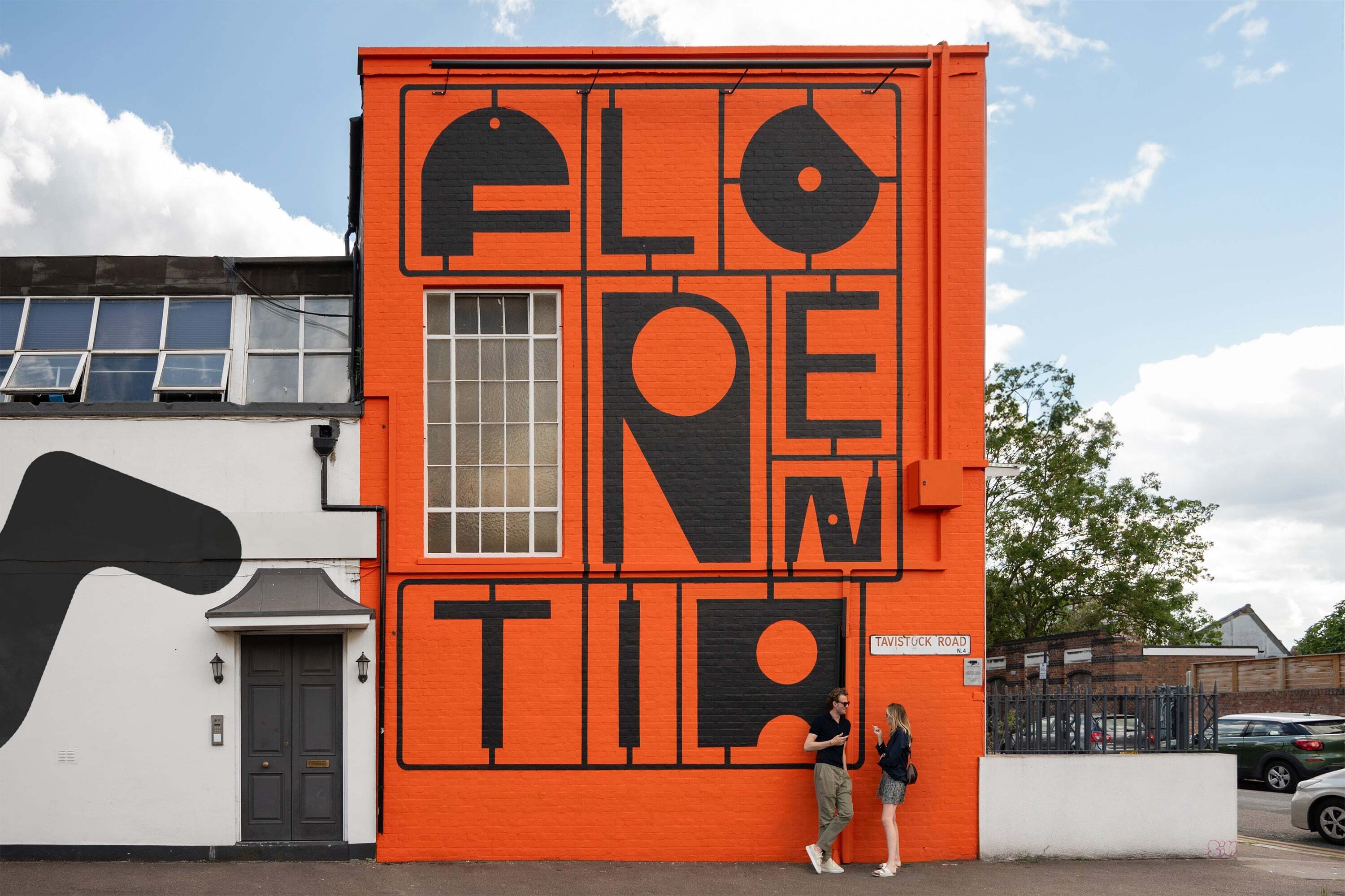
The revitalization of Florentia Village required a compelling brand identity that would capture the site’s industrial heritage and its aspirations for the future. DNCO, a design agency, took on the task of crafting a brand that exudes energy and vigor. Their approach involved creating a custom display typeface inspired by found objects, such as nuts, bolts, spanners, and brackets. The resulting letterforms are rendered as pleasingly irregular geometric shapes, paying homage to the broader manufacturing legacy of the site.
Celebrating Creativity and Expansion
The distinctive display typeface not only emphasizes Florentia’s industrial past but also signals its expansion into various creative spheres. DNCO’s design reflects the site’s growth into areas such as food, consumer products, film, theatre, music, design, and photography. By incorporating a vast array of alternate character designs for each letter, the brand hints at the limitless possibilities for future creativity within Florentia Village.

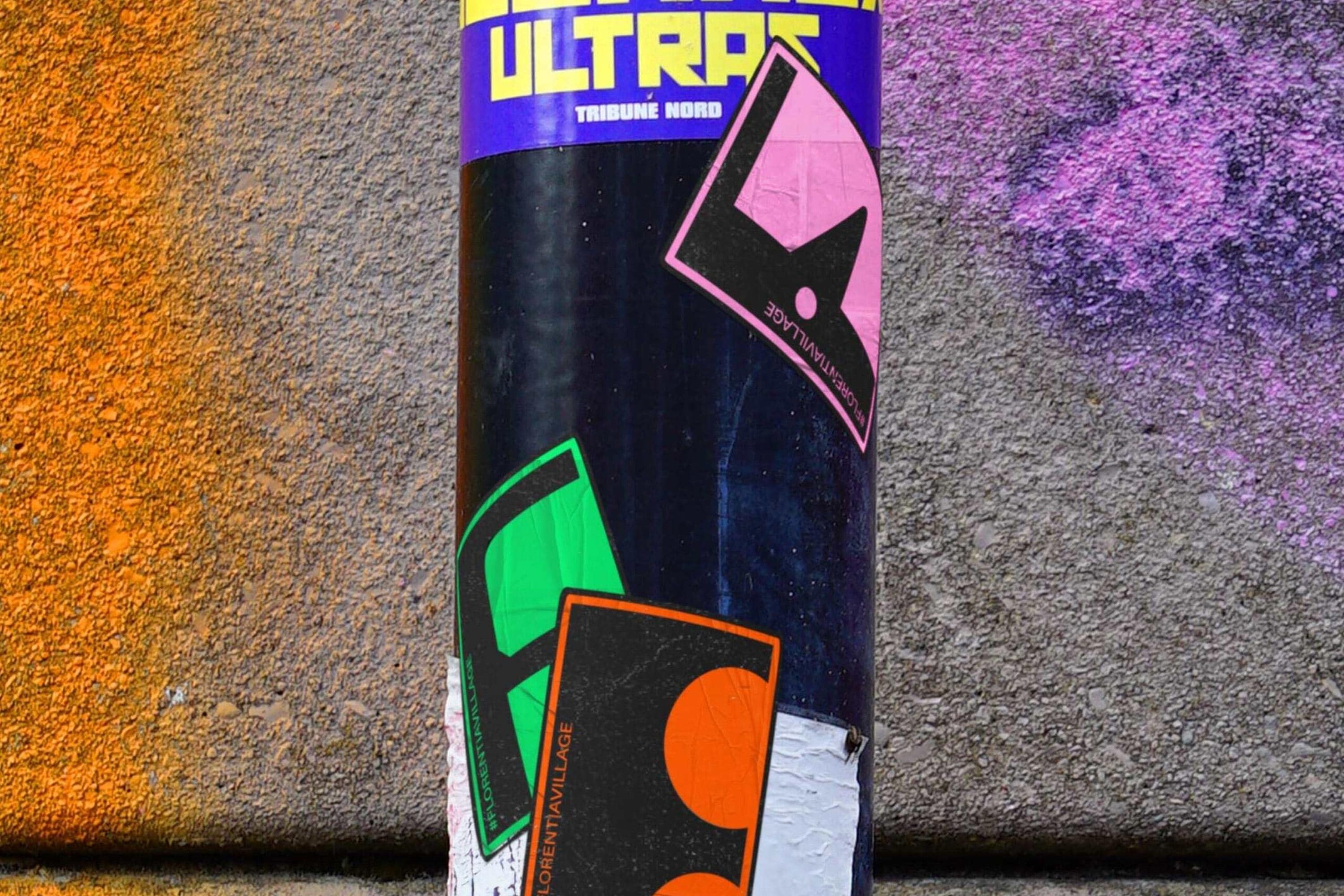
To unify the found-typographic elements, DNCO developed a clever framework inspired by punch-out kits reminiscent of Air-fix models. This framework features a neatly spaced tessellation of miniature and multifarious forms, held together by elegantly spindly plastic threads. While the graphic qualities of the punch-out kit framework are most evident in the stunning murals created by DNCO, they are also adaptable to a range of potential applications.
A Bold Color Palette
Out of the palette of neon bright colors used in the brand identity, tangerine orange stands out as the most prominent. This vibrant hue captures the vitality of Florentia Village’s design-led businesses while also paying homage to the site’s industrial heritage. Accompanying the tangerine orange are neon green, turquoise, and pink, which take the branding in a more vibrant and dynamic direction. These colors evoke a sense of festivity and excitement, aligning with the site’s aspirations to become a hub of creativity and innovation.
The Craft-Ale Scene and Millennial Affluence
The choice of neon green, turquoise, and pink colors in the branding is not accidental. It reflects a strategic decision to appeal to a younger, trend-conscious audience. In one of DNCO’s case study photos, hipsters in deliberately shabby attire can be seen sipping craft ales in front of hot pink walls. While this scene may be stereotypical of gentrified East London, it aligns with the developers’ goal of positioning Florentia Village as a modern, design-led creator space that appeals to a millennial demographic.
Combining Graphic Forms and Textures

One interesting element of contrast in the brand identity is the combination of graphic forms and textures. While the abstracted letterforms and bright colors dominate the visual language, a momentary glimpse of brown paper color and texture is seen in DNCO’s case study showreel. This skeuomorphic element adds depth and warmth to the brand, offering a potential avenue for combining different textures like corrugated steel or brickwork with the abstract graphic forms and vibrant colors.
Capturing the Essence Through Photography
In addition to the graphic elements, DNCO’s brand identity incorporates high-contrast direct-flash photography. This style complements the found typography and abstracted letterforms, capturing the reality of the creative businesses within Florentia Village. The art direction of the photography showcases the sometimes unglamorous, yet intriguing aspects of these businesses. From steam cleaning dresses to assembling photoshoot backdrops, the photography captures the excitement and energy of fledgling businesses, presenting them with both pride and humility.
Balancing Industrial Imagery and Floral Associations
Returning to the name Florentia Village, which evokes images of flourishing and prosperity, one wonders if the brand could have incorporated more specific references to the site’s history. While the industrial imagery of nuts, bolts, and spanners is captivating, a subtle inclusion of needle and thread motifs could have paid homage to the site’s textile manufacturing legacy. This would have served as a bridge between the highfalutin name and the bold industrial visuals. Nevertheless, the brand successfully captures a sense of energy and positivity, aligning with the organic nomenclature of Florentia.
A Versatile and Joyful Brand Identity
Despite the minor missed opportunities, the brand identity of Florentia Village exudes a great sense of energy and positivity. DNCO’s meticulous attention to detail is evident in the extensive library of alternate letterforms, the photography, and the dynamic grid system. The versatility of the brand allows it to adapt seamlessly to a wide range of applications, providing a joyful and vibrant atmosphere for the makers of Florentia Village. With this brand identity, the developers’ intentions to preserve the essence of Florentia Village are clearly communicated, promising a bright future for this South Tottenham warehouse complex.